Sunday, 2 January 2011

Research And Creating The Poster

Firstly we are going top do some further research into movie posters to get a better understanding the codes and conventions typical movie posters. For our poster it is important that we include all the conventions so that it looks professional and is instantly recognisable as a poster.


Requiem for a dream is a very similar genre to what we hope to achieve and therefore it is a good poster to view. I like the two large pictures involved here as it does not give the film away at all. However this poster could be seen as quite cheap as the two pictures are actually screenshots from the film. This does not show too much creativity, however the poster is effective. The poster has all the actors and the directors name on it and most importantly the film title in a large font so that it can be easily read.
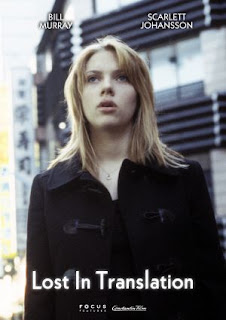


I think these two posters are effective as they are minimalistic at to the point. the posters feature the two main characters in the film and it does not give the story away. The different posters are very effective as it gives the variety and people aren't going to be bored of the same poster. They both show the actor/actress' names and the poster on the right also contains the tag line "Everyone wants to be found" which gives the viewer slightly more information relating to the story which leaves the guessing.


I think this poster is effective on many levels. firstly the use of concentric circles around the astronaut relates closely to the title "Moon". The poster keeps the story from the audience well however after watching the film the poster has more relevance. Sam Rockwell's character is very small on the poster, this may be because he feels isolated and alone on the film the same can be said about the black space around the edge.

After looking at these posters and others earlier in the blog, it seems that the most effective posters are those which are quite simple. We have put together an idea for our poster which was made by  Tom. However this is not the final design:


Our first attempt at a poster wasn't bad however it did not look professional and received lots of audience feedback about it being to busy which we agree with. we wanted to keep the digital font as this represented the time 19:22 which is highly relevant to our film. After some criticisms we decided to create a new poster taking into account our feedback.

This is what we created:

This poster has improved from the last on as it looks less busy but still has the Digital font. We have also chosen to highlight the title in red to make it stand out. We showed this to our audience and received some further audience feedback saying that the poster was a bit boring and needed something extra. We then decided to have more information at the bottom and the creators and actors names at the top. We also added a chemical formula for Korsakoffs psychosis to make the poster look more interesting. We also decided o take numbers 19:23 and 19:24 out of the poster as they were bigger than the title and took away from it. Like the Lost In Translation poster we also decided to add a tag line to our film to reveal slightly more to the audience.

This is our final poster:

Saturday, 1 January 2011

Filming and Editing


The filming process was relatively straight forward and was completed over four sessions spanning 2 months. The majority of was filmed at Sam (actors) house with the car scene filmed at Linford Bottom. Overall we think that filming went quite smoothly as we paced our filming over multiple sessions in order to take our time with the shots we used. We had a rough script of shots that we wanted to use and the general direction of the film however when we were filming we also experimented with different shots that we thought might work and we could try out in the edit. this gave us some variety when it came to the edit and gave us some back up shots too. The whole sequence was filmed on a Cannon HV30.
This camera has a HD option however we decided not to use it as we only had standard def tapes and HD also takes up a lot of hard drive space for a video that is going to end up on YouTube. The camera worked well enough on standard definition and also helped us to create some of the shots. For example we used the light on the front of the camera for the final shot to give the shot a dark and disturbing feel which I think worked quite well.

Overall I think our filming when quite smoothly as we did not encounter any problems with sound or with the footage we recorded, however we did have to revisit a couple of shots to get correct continuity.


The editing process was quite straight forward however was quite straight forward however quite time consuming as it was very easy to keep tweaking and changing around to make it more polished. To create the edit we used Adobe premiere pro CS5 which was able to cater for everything we wanted to achieve. The editing took place in between filming sessions, this was so we could get a rough idea of what it will look like as we were still creating the film. This helped us get a feel for how the film will look and also gave us some direction. It also helped us to receive our audience feedback as we were able to show roughly edited short sections from the film and gain valuable feedback to help improve and polish the edit.

Our film uses many different effects available on premiere pro that help to follow the conventions of the genre. For example there is quite a lot of blurs in the film as this is to help convey the characters state of mind.  The sound in the film also helps to do this as it consists mainly of distorted drones and uneasy sounds that help the audience get in the head of the character. The sounds (apart from the songs) are all obtained from freesound and are layered to create a more polished sound as opposed to a single distorted sound. The sound also helps build up the tension in the film. This is most apparent in the last shot which I think shows his state of mind the best. The use of titles in our edit is particularly important as it highlights the time at which his hallucinations are occurring and also helps represent the story to the audience. The use of black clips in the film also and the flashing light also helps to create a distortion effect that the audience can relate to.